
Tools for detecting html content overflowing and building better responsive layouts
Copy the command below to clone the repository to your machine.
Build around content, not breakpoints.
overflow-guard includes two packages:
| React | HTML |
|---|---|
overflow-guard-react |
overflow-guard-html |
| React component and hook API for adaptive UI. | Framework-agnostic custom element for adaptive UI. |
bun add overflow-guard-react |
bun add overflow-guard-html |
| React docs · Package README | HTML docs · Package README |
The recommended AI integration path is TanStack Intent.
overflow-guard-react and overflow-guard-html ship their own package-local skills so the guidance can stay aligned with the installed library version.npx @tanstack/intent@latest list to discover available skills in your project.Full docs: packages/overflow-guard-react/README.md
overflow-guard-react helps React UI adapt when content stops fitting, instead of relying on viewport breakpoints, container breakpoints, or magic numbers.
Wrap a piece of UI in <OverflowGuard>, and it tells you when content no longer fits the available space. You can then switch to a compact layout, collapse actions to icons, swap a full nav for a menu, or reveal a "Read more" affordance.
bun add overflow-guard-react
npm install overflow-guard-react
pnpm add overflow-guard-react
yarn add overflow-guard-react
overflow-guard-react is a client-side package. It measures rendered DOM with ResizeObserver, so use it from client components in frameworks that distinguish server and client rendering.
import { OverflowGuard } from "overflow-guard-react";

export function AdaptiveToolbar() {
  return (
    <OverflowGuard>
      {(isOverflowing) => (
        <div className={isOverflowing ? "toolbar toolbar--compact" : "toolbar"}>
          {isOverflowing ? (
            <>
              <button aria-label="Search">S</button>
              <button aria-label="Share update">U</button>
              <button aria-label="Launch flow">+</button>
            </>
          ) : (
            <>
              <button>Search</button>
              <button>Share update</button>
              <button>Launch flow</button>
            </>
          )}
        </div>
      )}
    </OverflowGuard>
  );
}
isOverflowing: true when content overflows on any axisoverflowAxis: 'none' | 'horizontal' | 'vertical' | 'both'For fallback mode, render props, hooks, and more detailed examples, see packages/overflow-guard-react/README.md.
Full docs: packages/overflow-guard-html/README.md
overflow-guard-html is a framework-agnostic custom element that measures whether rendered content still fits its available space and applies reversible fallback mutations when it does not.
It keeps a hidden measurement copy of the original content, watches that copy for overflow, and only mutates the visible primary tree.
bun add overflow-guard-html
npm install overflow-guard-html
pnpm add overflow-guard-html
yarn add overflow-guard-html
For no-build pages, prototypes, embeds, or CMS usage, you can load the browser bundle directly from a CDN:
<script src="https://cdn.jsdelivr.net/npm/overflow-guard-html@0"></script>
If you prefer a module script instead, load the ESM file directly:
<script
  type="module"
  src="https://cdn.jsdelivr.net/npm/overflow-guard-html@0/dist/index.js"
></script>
<script src="https://cdn.jsdelivr.net/npm/overflow-guard-html@0"></script>
<style>
.toolbar .icon-action {
display: none;
}
.toolbar.toolbar--compact .full-action {
display: none;
}
.toolbar.toolbar--compact .icon-action {
display: inline-flex;
}
</style>
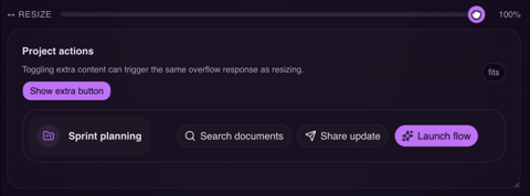
<overflow-guard fallbackClass="toolbar--compact">
<nav class="toolbar">
<span>Sprint planning</span>
<div>
<button class="full-action">Search documents</button>
<button class="icon-action" aria-label="Search">S</button>
<button class="full-action">Share update</button>
<button class="icon-action" aria-label="Share">U</button>
<button class="full-action">Launch flow</button>
<button class="icon-action" aria-label="Launch">+</button>
</div>
</nav>
</overflow-guard>
overflowing: present when overflow is active on any axisoverflow-axis: none | horizontal | vertical | bothdata-overflow-axis: same value as overflow-axisFor attributes, events, methods, and usage notes, see packages/overflow-guard-html/README.md.